


Okay, so the AqCom tradition of gradual redesign has come back with something of a vengance after a year of relative stagnation, enough for me to stick a peg in the ground and say “This is what it looks like now”, anyway.
This is what it looks like now:

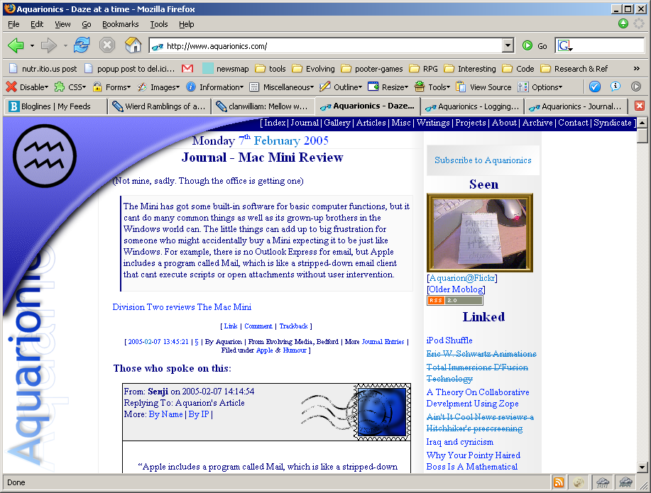
(A rare view there of the elusive AqCom admin interface, such as it is)
The thing that drove the design was the fact due to my current “Sunlight at weekends” status (It’s winter, I leave home before dawn and arrive back after dusk. And, obviously, I walk fifteen miles uphill both ways, in the snow! and sleet! And we never weren’t given breakfast, we weren’t) I haven’t been able to take photos for the banners, eventually falling back from weekly, to monthly banners, and for the last week it’s defaulted back to the original one. Enough was enough. Time to design around it.
Also, I missed the swish. The swish is the design term for the curve that graced AqCom 7 & 8, was replaced with the glasses for 9 and ditched for the banner in 10. I wasn’t happy with the huge gutter it left down the left hand side, really. And since the shape meant that gutter or a large gap at the top – or a medium gutter on both – I was stuck. I couldn’t make the text scroll over it, that looked silly.
Can’t go over it, Can’t go ‘round it, have to go under it.
The swish is now a png, with a semitransparent shadow, placed in a design-element div (yes, ick, but occasionally we sacrifice elegance for beauty) absolutly in the top left hand corner. It’s given a z-index of 200. (The stamps and postmarks have 100 and 101 respectivly, the 200 means that – should it be an issue – they will slide under the swish) and yay, text disappears into the shadows under the arch, isn’t that neat?
Well, yes, yet not perfect. The problem with the swish being on top of the text is that clicks ignore transparency. Any links (or input elements) displayed within the boundry box of the div that displays the swish weren’t clickable, since you weren’t clicking the link but the image over the top of them.
Bother.
This stopped the idea for a while, while I moved the header from over the top to the current graphic (filling in the gutter down the left I hated so much. Later revisions of Aq10 had a migrane-inducing black & white tiled pattern down there).
What I needed to do was give the links a Z-Index higher than the swish. I initally put Z-Index: 202; onto the “item” class – of which every block of main content on AqCom is a member – but that meant that the text flowed over the top of the swish again, which still looked just as bad as the first time I nixed the idea.
The problem was solved by Rory when he informed me that Absolute didn’t do what I thought it did, because in playing with that and the postmarks, I realised that there was a solution. It is this:
a, input, textarea, select {
position: relative;
z-index: 202;
}
Spot that? The position means it can get a z-index, but the lack of any further instructions means that the only way it moves is outwards. Everything that isn’t a link slides under the shadow, but links – which are almost the same colour as the top of the fade anyway – slide over the swish and are thus clickable.
Last problem was that the swish was obscuring too much of the text, which annoyed me, so I made it smaller. Eventually I’ll probably move the site content down a bit so I can put the full-sized curve back. The two full sized curves look like this:
- iSwish
So this is unlikely to stay still very long…